Belong
Listing card
Directory, blog, events — terracotta border on hover.
Design system
The single reference for how Bushbrook looks, reads, and behaves on the web — for the public site, customer accounts, emails, and any partner touchpoints. Keep everything warm, local, and consistent.
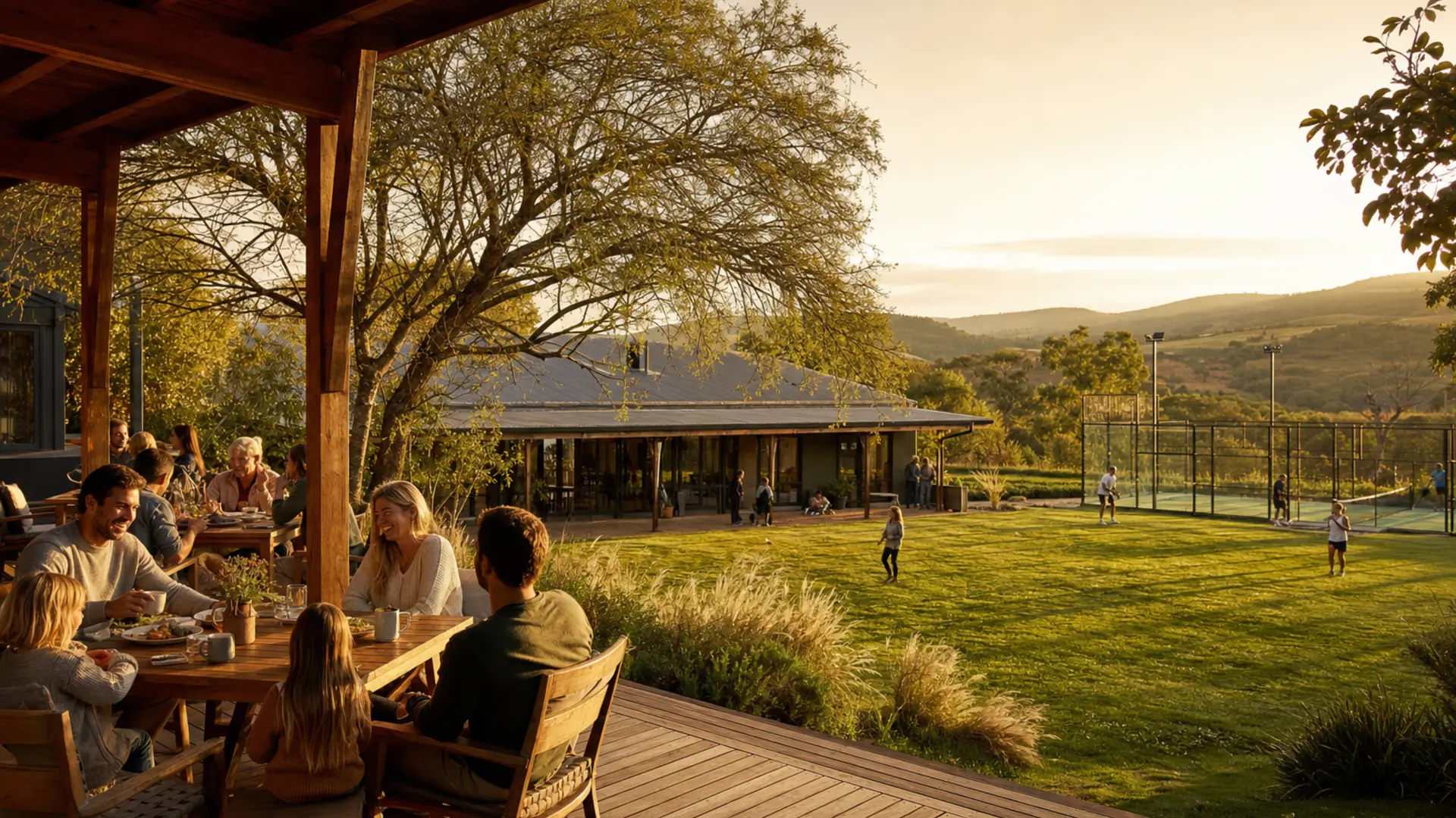
Bushbrook is a community leisure hub in Christon Bank — a place to eat, play, gather, learn and belong.
EAT • PLAY • GATHER • LEARN • BELONG
Bushbrook is a community leisure hub in Christon Bank — restaurant, padel, fitness, play school, events, and venue hire under one roof. It is not a single-use venue or a corporate resort. The brand should feel like a modern village hall, farm-style café, and garden gathering space: warm, natural, calm, local, and family-friendly.
| Pillar | What it means on the site |
|---|---|
| Eat | Restaurant on the verandah — table requests |
| Play | Padel courts — book while signed in |
| Gather | Events, venue hire, community |
| Learn | Fitness, wellness, play school |
| Belong | Directory, news, neighbours |
Copy and layout should reflect how people actually use the place: play school in the morning, coffee on the verandah, yoga or padel mid-morning, lunch with family, an afternoon event, evening celebrations. Show the flow of life, not isolated silos.
Write like a neighbour explaining the place — simple, human, and local. Use short sentences. Name Christon Bank where it helps trust and search.
“Whether you are booking a table, a padel court, or a morning yoga class — welcome home to Bushbrook. Tell us about dietary needs when you book; we will confirm your table by email.”
“Experience our premium lifestyle destination. Reserve your exclusive dining experience today and elevate your leisure journey.”
Horizontal lockup
Header, admin panel, auth (mobile)
Stacked lockup
Footer, favicon (on cream)
Horizontal on olive
Auth sidebar only — invert treatment, no other recolouring
#F5EBE0.Cream
#F5EBE0
Tailwind: cream
Page background, favicon background, text on terracotta buttons
Olive
#4A5D23
Tailwind: olive
Headings, body text, secondary buttons, browser theme
Terracotta
#B57133
Tailwind: terracotta
Tagline, primary CTAs, accents
Stone wash
#F5F5F4
Tailwind: stone-100
Alternate section backgrounds
#3d6b52
WhatsApp buttons only — hover #345c47
Booking status only: pending (amber), confirmed (green), cancelled (red). Do not use these as brand colours.
Display · Cinzel
Your place to gather
Page titles — class .section-heading
Body · DM Sans
Relaxed dining on the verandah at Bushbrook. Book a table for families, friends, and celebrations in Christon Bank.
Body, forms, navigation, buttons
Tagline track
EAT • PLAY • GATHER • LEARN • BELONG
Class .tagline-track — uppercase, letter-spacing, terracotta
Load Cinzel 400/600/700 and DM Sans 400–700 with display=swap. Form inputs at 16px minimum on mobile.
.page-container — max 72rem, horizontal padding 1rem.py-12 md:py-16; heroes py-10 sm:py-12 md:py-20.sm / md / lg as needed.rounded-lg on controls; rounded-2xl on cards.border-olive/10; light shadows only.max-w-xl; marketing content max-w-6xl.
Use these classes on every public form. Wrap groups in .form-card. Two-column rows: grid gap-5 sm:grid-cols-2. Party sizes: grid-cols-2 sm:grid-cols-3.
.form-label · .form-label-optional
.form-input · .form-select · .form-textarea
.form-checkbox · .form-radio
.form-hint · .form-error
.form-card
Reference form (display only).
South African format preferred; used for booking confirmations.
Please enter a valid email address.
Auth form (Breeze)
Eat
Frosted white panel on cream — forms and focused content.
Belong
Directory, blog, events — terracotta border on hover.
Photography should feel like a warm South African countryside hub: natural light, wood and brick, verandah dining, garden and playground, families and friends together — relaxed, never corporate. No logos or text baked into images.
Avoid: luxury hotels, neon nightlife, empty fine-dining plates, generic gyms, over-smoothed AI faces, non-local architecture.
Marketing placeholders: public/images/generated/ · Tenant and blog images: uploaded in admin.
Tailwind CSS only. All public and customer-facing UI is built with Tailwind utilities and Bushbrook component classes (.btn-primary, .form-input, etc.).
Do not use Bootstrap — no Bootstrap package, imports, or class names (row, col-*, btn btn-*, form-control, etc.). Filament admin uses its own styles; keep it separate from the marketing site.
Visual and copy rules above apply across the public site, customer accounts, and staff admin. Product constraints that affect brand in UI:
wa.me links and floating button; muted green is reserved for WhatsApp CTAs only./admin; primary olive #4A5D23, accent terracotta #B57133, horizontal logo.| What | Where |
|---|---|
| Brand config | config/bushbrook.php |
| Colours & fonts | tailwind.config.js |
| Component classes | resources/css/app.css |
| Styling rule | Tailwind only — no Bootstrap (.cursorrules) |
| Agent guidelines | .ai/guidelines/bushbrook.md · .cursorrules |
| Logos | public/images/brand/ |